


Whether you're a designer, developer, or business owner, learn these free tips to help you meet Web Content Accessibility Guidelines (WCAG) and build a website that will provide an equal browsing experience to all visitors, regardless of ability.
You have to make a conscious effort to tweak your Webflow website to be completely accessible to people with disabilities.
Moral viewpoint aside, there is a lot to gain by ensuring your site is accessible. The disability community consists of 1.3 billion people, and has more than $13 trillion in expendable income.
What is an accessible website?
At its core, an accessible website is one that accommodates all visitors, no matter their abilities. In more practical terms, for your Webflow website to be considered accessible, it will need to conform to the Web Content Accessibility Guidelines (WCAG). Created by the World Wide Web Consortium (W3C), WCAG sets the benchmark for web accessibility, influencing laws like the Americans with Disabilities Act (ADA).
WCAG is based on 4 guiding principles:
- Perceivable: Users (or website visitors) should be able to perceive content appearing on your Webflow website through their senses of sound, sight, and touch
- Operable: Website visitors need to be able to operate your Webflow site even if they have a disability. To that end, people need to be able to operate it entirely by keyboard, sight-assisted navigation, and other alternatives to a classic mouse
- Understandable: Your Webflow site needs to be easy to understand. What that really means is shouldn’t feature overly technical terms or complex terminology
- Robust: For your Webflow website to be robust, it needs to: Use HTML and CSS according to specification, and it also needs to be compatible with tools like screen readers (used by blind people to navigate websites)
There are three versions of WCAG:
- WCAG 2.0 - an older version of WCAG
- WCAG 2.1 - published in 2018
- WCAG 2.2 - published in 2023
Each version of WCAG has three levels you can conform to:
- Level A - the lowest level
- Level AA - the conformance level referenced in most accessibility laws around the world
- Level AAA - the highest and most difficult level of conformance to achieve
It is best to try and ensure that your Webflow website conforms to WCAG 2.1 or 2.2 at Level AA.
Webflow’s built-in accessibility tools
Unlike other CMSs and website builders, Webflow actually has some pretty nifty accessibility features and tools.
The first focal point is the Audit panel. You can find it in the lower left side of the Designer.
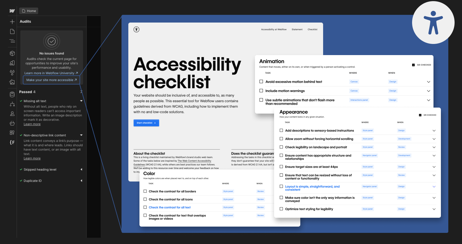
This panel is instrumental in highlighting areas of your site that may fall short in accessibility, such as:
- Missing alt text for meaningful images, vital for screen reader users (and for SEO in general)
- Non-descriptive link text that can confuse users who aren't sure where a link will take them
- Incorrectly structured headings, which can disrupt the flow and understanding of the page for people using assistive technologies
Additionally, Webflow’s Style panel includes a built-in color contrast checker. This tool is essential for ensuring that the color contrast between your text and its background conforms to WCAG Level AA (and the more stringent Level AAA). Any color combinations that fail to meet these standards will be clearly indicated, helping you make necessary adjustments.
Two more cool tools you can check out are:
- Text Zoom Preview, which simulates how users might experience your site using browser zoom capabilities, enlarging text up to 200%. This preview helps you identify and fix issues related to layout breakages or text wrapping, ensuring that content remains accessible and legible even when zoomed in
- Vision Preview, which enables you to view your website as someone with various vision impairments might see it. This includes conditions like green color blindness, blue-yellow color blindness, full spectrum color blindness, and blurred vision. This perspective helps you understand and rectify any visual elements that might hinder accessibility

Tips on improving accessibility in Webflow
Fully conforming to WCAG at Level AA entails making a number of technical and design-based modifications to your site:
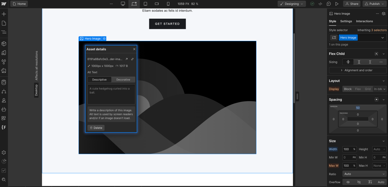
- Add alt text to meaningful images
Alt text is a brief description that explains the content and function of an image on a webpage. It is essential for users with vision impairments, as screen readers read this text aloud, allowing them to understand images they cannot see.
In Webflow, you can add alt text directly in the Asset panel for each image or update it in the Style panel for specific images.
For images within CMS collections, ensure there's an alt text field mapped to each image.
Additionally, for the Multi-Image field, provide alt text for each image included.
PRO TIP: Images that are purely decorative and that do not add informative value, should be hidden from screen readers and marked as decorative. This can be done by selecting the 'Decorative' option in the image settings within the Assets panel or, for images in Rich Text, clicking the wrench icon and choosing "None: image is decorative" for the Alt Text option.
- Use the right color contrasts
According to WCAG, the minimum contrast ratio between text and its background should be 4.5:1 for normal text and 3:1 for large text (above 18pt). This rule ensures that your content is accessible to users with vision impairments, including those with color vision deficiencies.
The principle of sufficient color contrast extends beyond text to include meaningful non-text elements on your website. These include graphical objects, interface components like form input fields, and important icons such as those used for social media or navigation. These elements must be easily distinguishable to all users, including those with color vision deficiencies.
WCAG contrast requirements do not extend to logos.
- Use readable fonts
WCAG guidelines emphasize the importance of using fonts that are easy to read, which is crucial not just for individuals with disabilities, particularly those with vision impairments.
However, it is important to stress that readable fonts benefit everyone, not just those with disabilities. Most website visitors skim content, searching for key points rather than reading every word. Therefore, clear, legible fonts improve user experience and engagement.
You can ensure that your text remains legible across different devices by using CSS relative units for font sizes. Webflow simplifies this process, allowing you to select relative units like REM, which scales with the default browser font size, typically 16px. In the Style panel, you can convert pixels to REMs using simple math, for example, by entering "120/16rem" to get 7.5rem, ensuring text scales appropriately and remains readable on any device.
- Add descriptive link texts
Links are vital for website navigation, guiding users from one page to another and forming an essential part of the user experience. To make these navigational elements accessible, especially for users of screen readers, it's crucial to use clear and descriptive anchor text for all links. Anchor text is the visible, clickable part of a link, such as the phrase "Find out how" in a call to action.
Ensure that your link text is informative and meaningful on its own. Users, particularly those with vision impairments, often navigate by skipping from one link to the next. If the anchor text can stand alone and still convey where the link leads, you've made your site more accessible and user-friendly.
- Add captions and transcriptions to videos
Captions are text descriptions of dialogue and significant sounds in videos, and are essential for viewers with hearing impairments, allowing them to fully understand video content.
IMPORTANT: While platforms like YouTube offer automatic captions, these should be reviewed and corrected for accuracy to meet WCAG standards.
Similarly, Vimeo supports uploading your own caption files and offers an auto-captioning service, which also requires verification for accuracy.
In addition to captions, providing a text transcript of your video can greatly enhance accessibility. Transcripts detail all spoken dialogue and describe significant visual elements in the video. They benefit not only individuals with hearing impairments but also those who prefer reading to watching or those in sound-sensitive environments.
When adding transcripts, you can place them directly beneath the video, beside it, or on a separate page, linked clearly for user convenience. Consider employing transcription services or software to create accurate and comprehensive transcripts for your videos.
- Make sure your online documents are accessible
Online documents, like PDFs, are commonly used on Webflow websites for a variety of purposes, from restaurant menus to downloadable eBooks for SaaS platforms. Ensuring these documents are accessible to all users, especially those using assistive technologies, is crucial.
An accessible online document should include:
- Proper tags: These structure the document logically for screen readers, similar to web page headings
- Legible and large text: The text should be easily readable for everyone, including individuals with vision impairments
- Proper color contrast: Ensure there is sufficient contrast between text and background colors to facilitate easy reading
- Alt text for meaningful images: Images within the document should have descriptive alt text for those who can't view them
- Descriptive link text: Links should convey clear and accurate information about their destination
- Use a proper heading structure
Effective heading structure is essential for navigating a website, especially for individuals with cognitive disabilities or those using screen readers. Think of headings as a table of contents: they divide content into manageable sections, making information easier to understand and navigate.
Ensure your headings are not only clear and descriptive but also adhere to a logical hierarchy:
- H1 headers denote the main title and should be used once per page to highlight its overarching theme.
- H2 headers break down the content into major sections, each representing a distinct topic or theme within the page.
- H3 headers are for subsections within these H2 sections, elaborating on various facets of each main topic.
- H4, H5, and H6 headers further dissect these subsections, adding layers and aiding in a well-structured dissemination of information.
BONUS TIP: Note that increasing text size alone does not make a title a heading; actual heading tags are required for screen readers to recognize the text properly as such.
In Webflow, you can implement proper headings by selecting the desired heading level in the Typography section of the designer elements panel. This ensures that your content is accessible and easy to navigate for all users.
- Ensure site navigation solely via keyboard
People with certain motor disabilities must be able to navigate your entire website using only their keyboard. Additionally, people who are blind (or those who have certain cognitive disabilities) need to be able to navigate your website using assistive technology like screen readers.
Both of these elements require more technical measures in your website code. This is where using a Webflow accessibility app, like accessWidget, can really help.
It runs an automated audit of your website, and automatically apply the necessary remediation measures to ensure screen reader compatibility and keyboard-only navigation.
Conclusion
- Creating an accessible website can greatly increase your bottom line (and help you comply with web accessibility laws, like the ADA)
- You will need to pay special attention to various elements of your website to ensure you are conforming to the Web Content Accessibility Guidelines (WCAG) Level AA
- Covering screen reader compatibility and keyboard-only navigation can be more difficult and labor-intensive


